THE BRIEF
NueFoil, a cutting-edge start-up focused on transforming the world of boarding, approached us to create their branding and design the skins for their innovative new range of e-foil boards.
Our proposal: to craft designs unlike anything seen on the water before – dynamic, vibrant, and polished. That say to the world ‘we’re here. Come have fun.’
From the brief:
We are democratizing the most fun, but previously elitist, water sport in the world. Blowing it wide open for everyone. And doing it with a sense of style and grooviness the others would never dare.
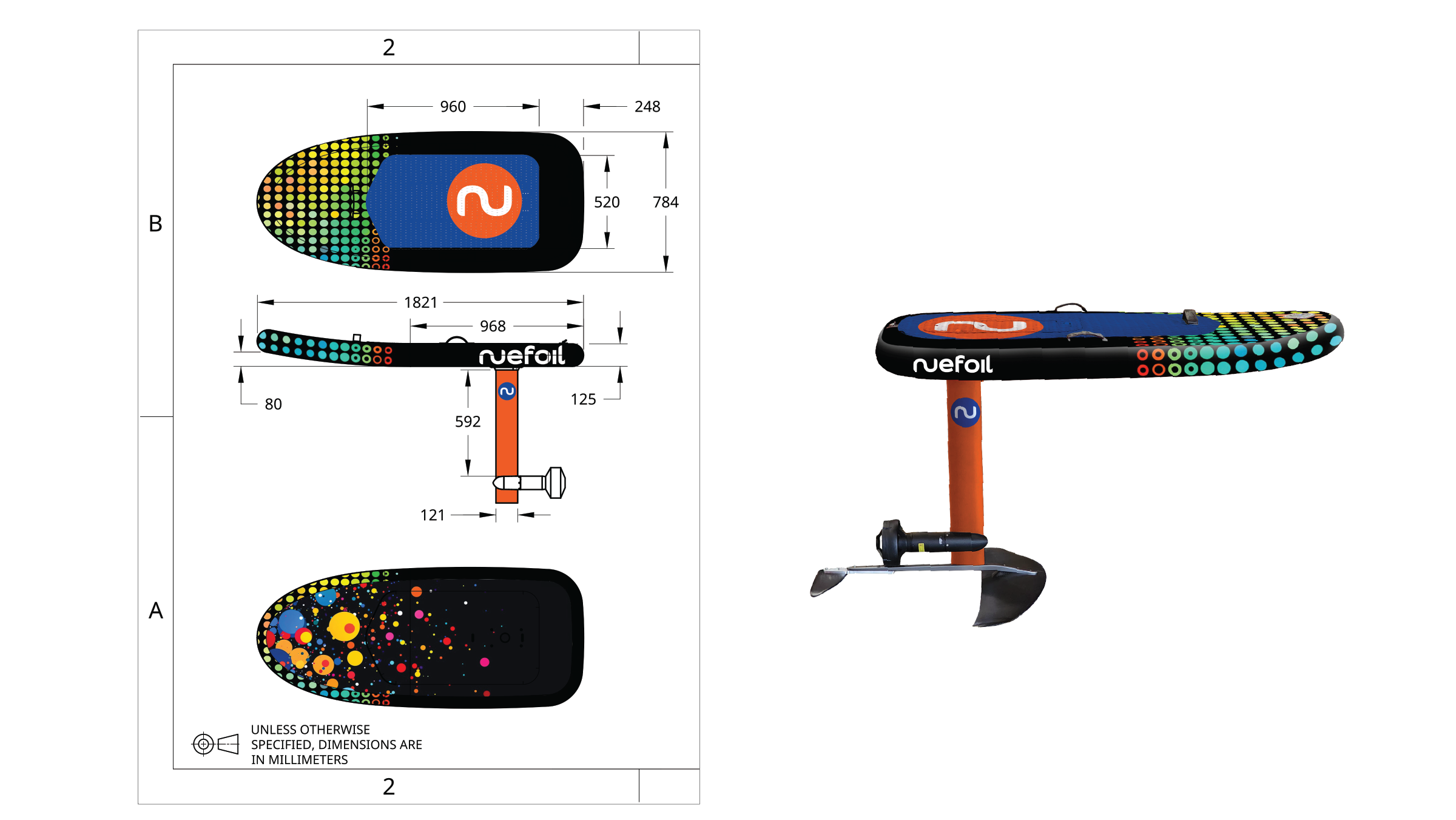
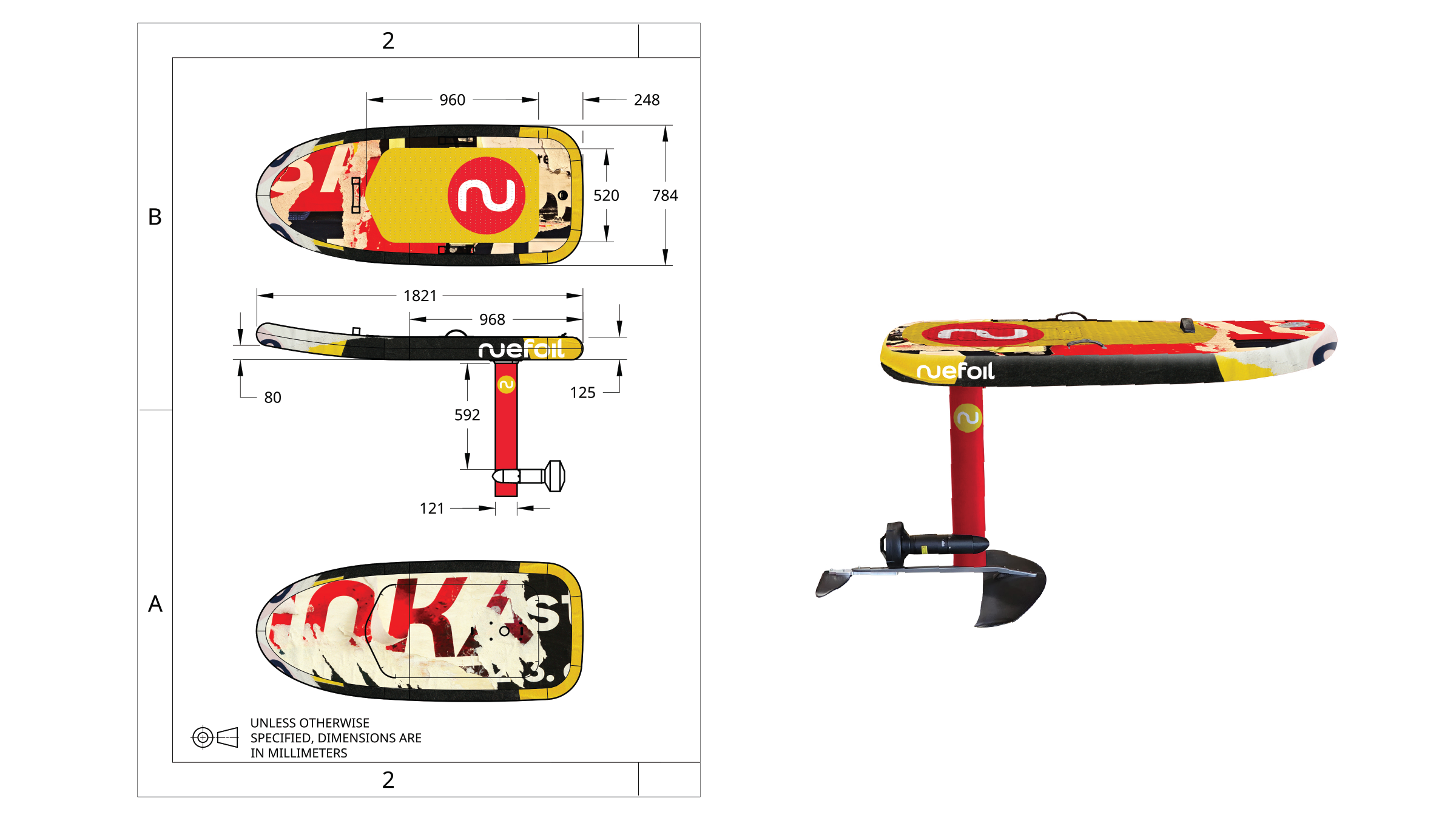
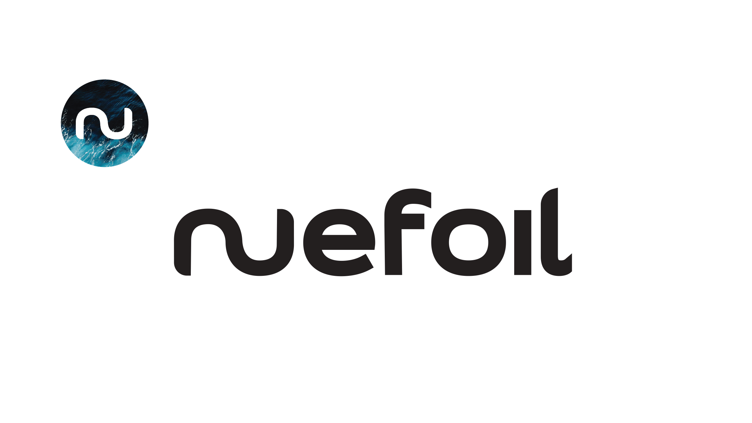
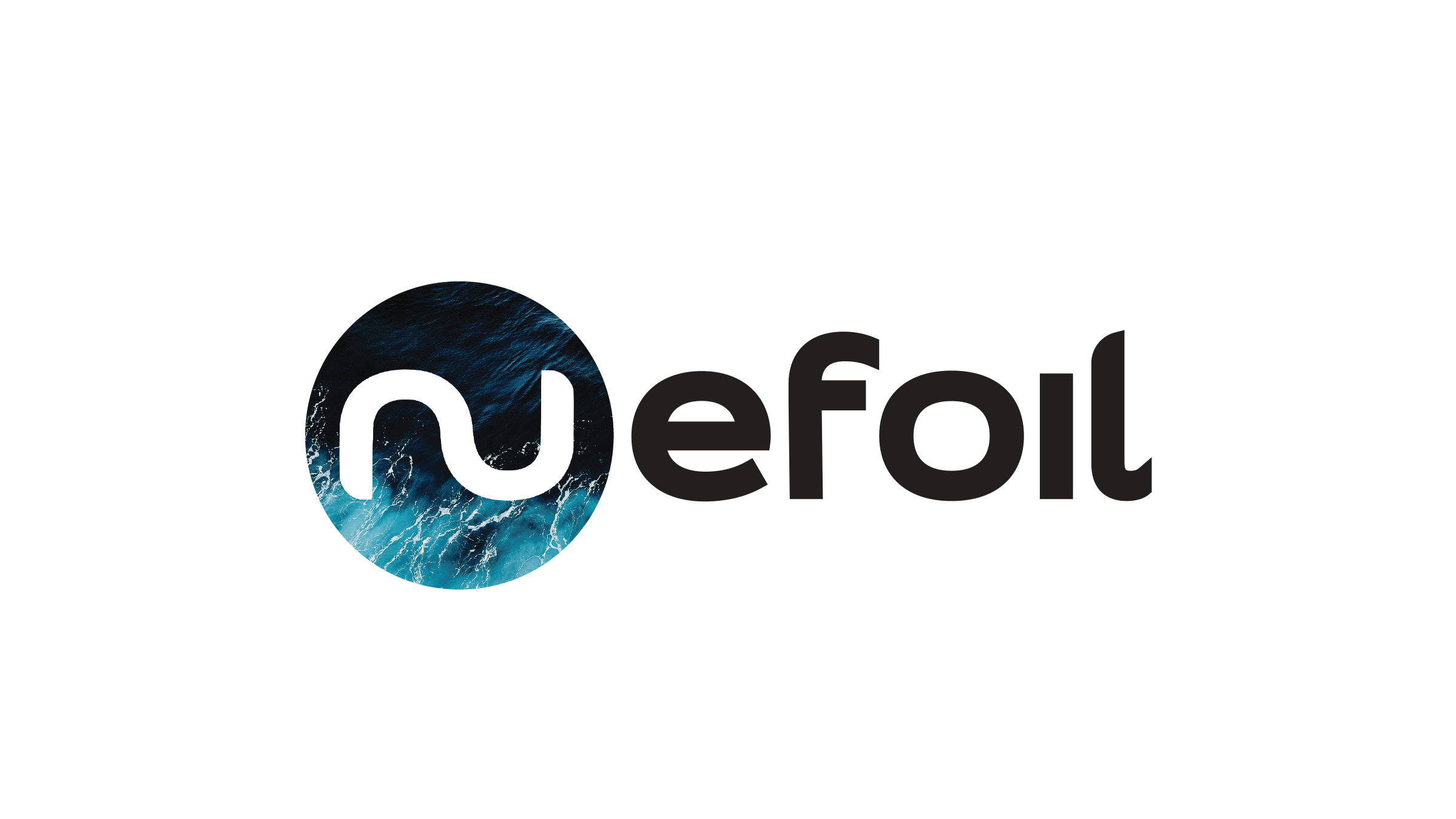
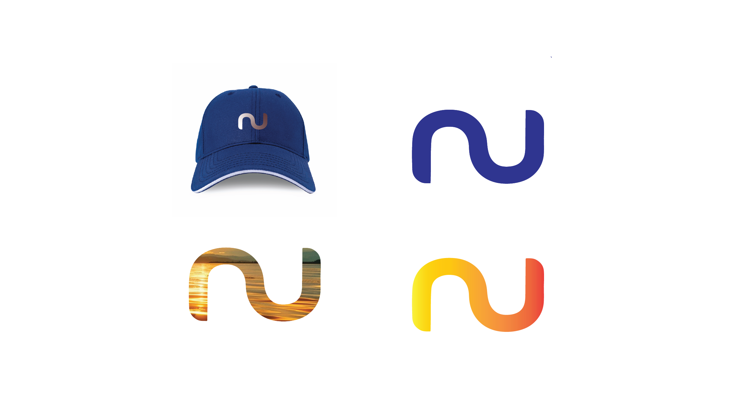
BRAND IDENTITY
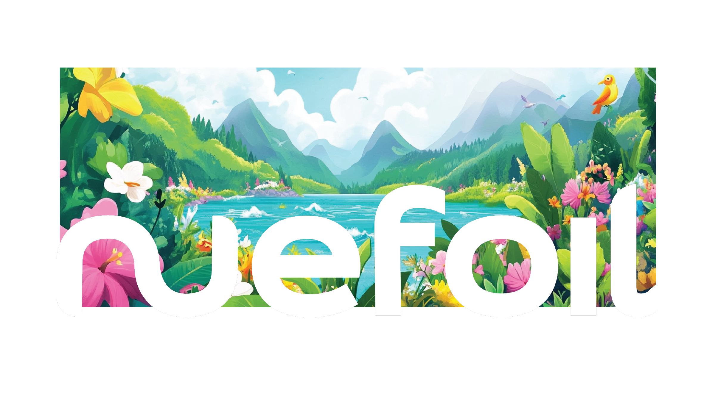
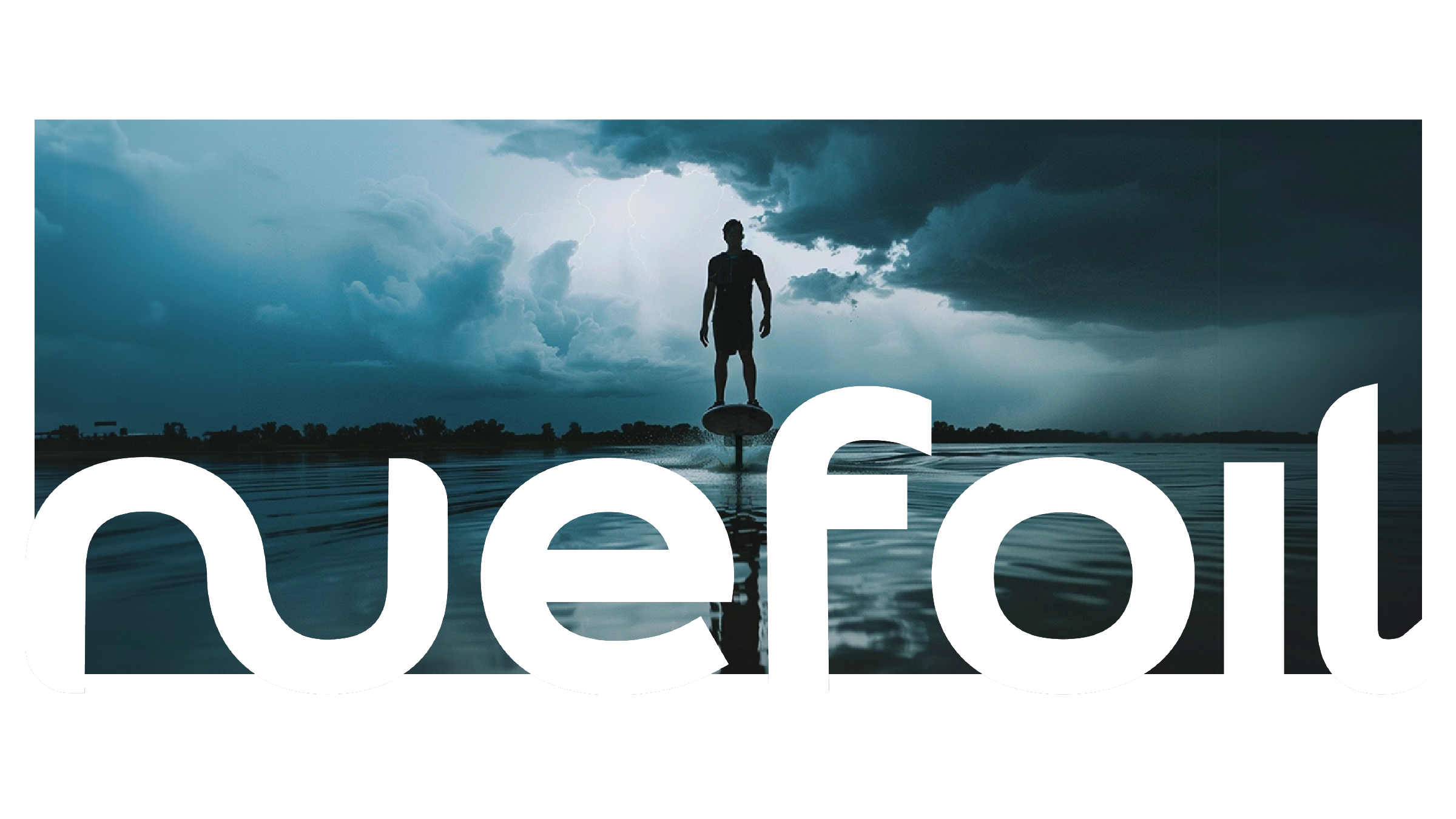
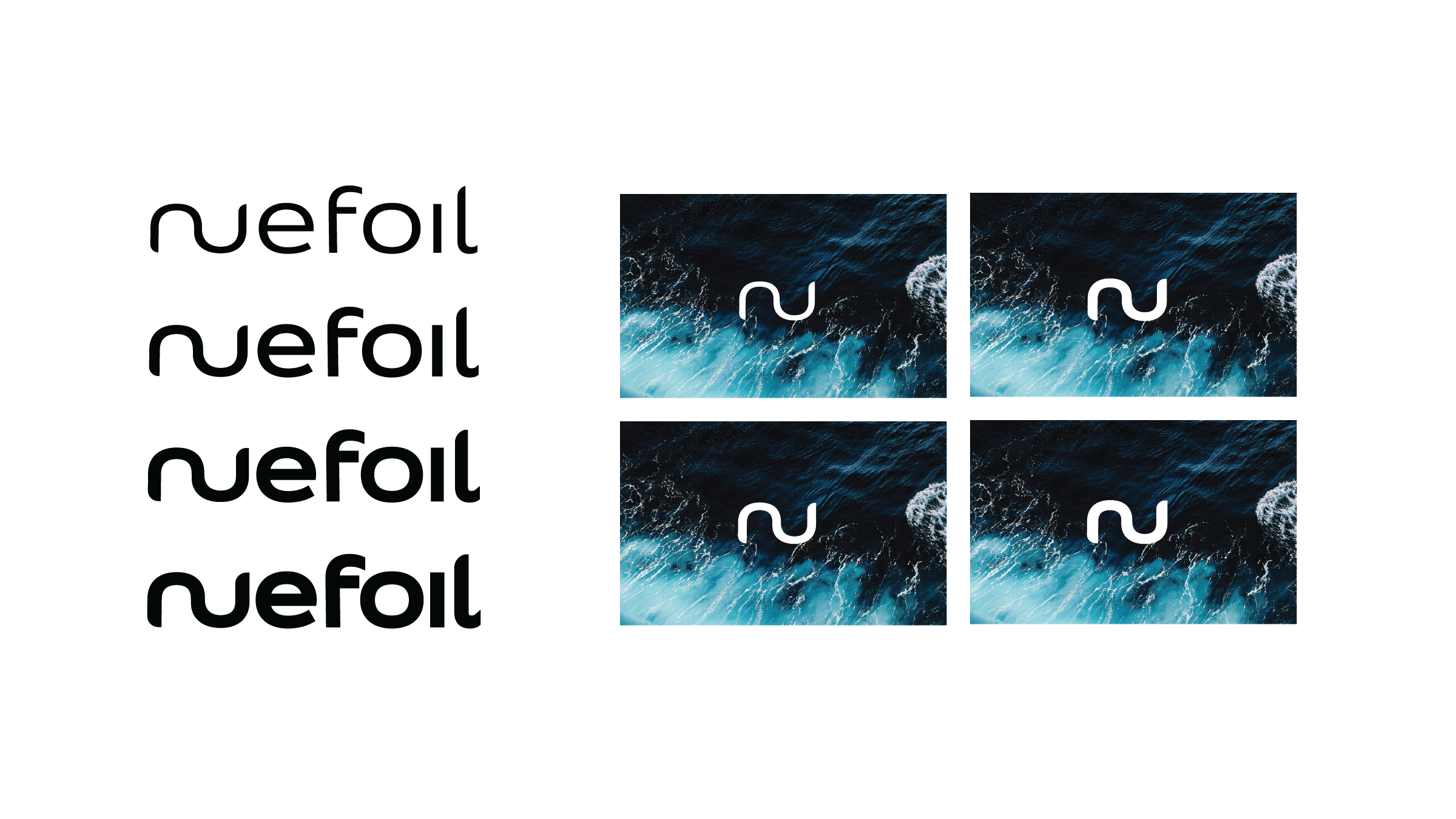
For the brand identity we developed the ‘Nu’ as a single element – reflecting both a wave and the board shape.
We also wanted to subtly separate ‘Nu’ to give clarity to the ‘efoil’ product descriptor.
Finally it was important to keep the logo simple as we knew that we’d be applying it to the wildly varying graphics on the boards themselves. A graphic constant in a world of the unexpected.
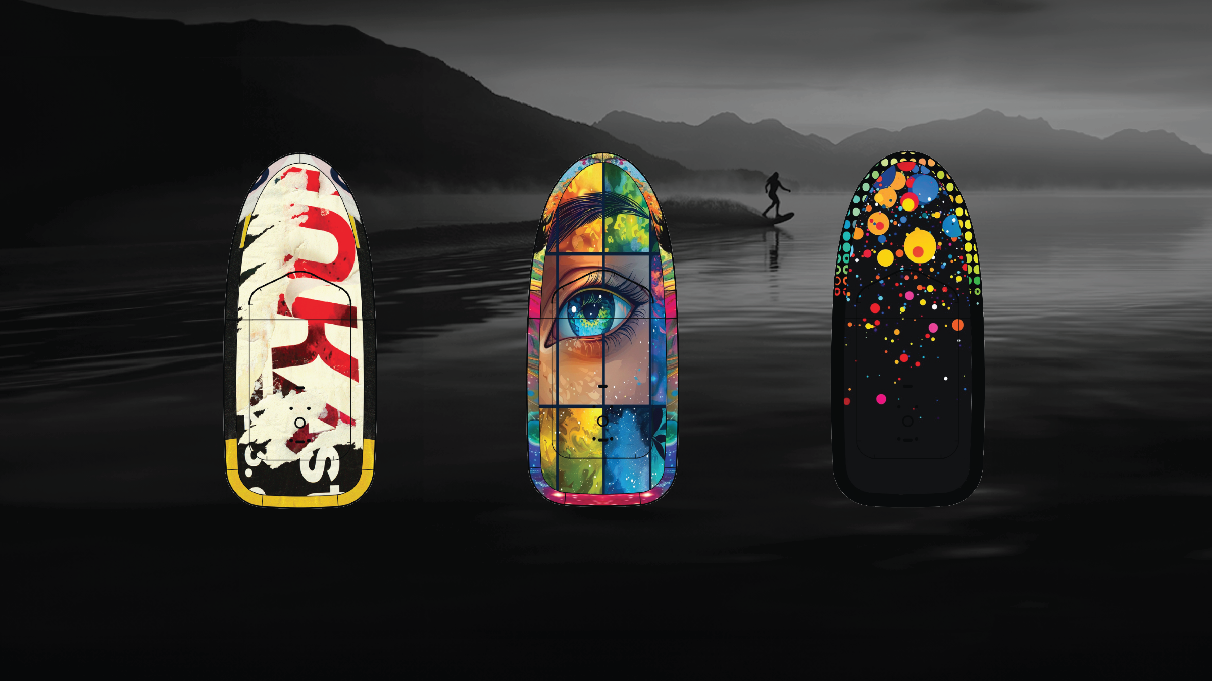
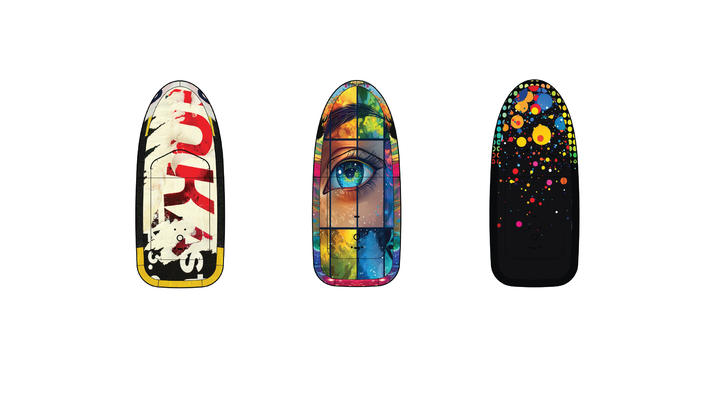
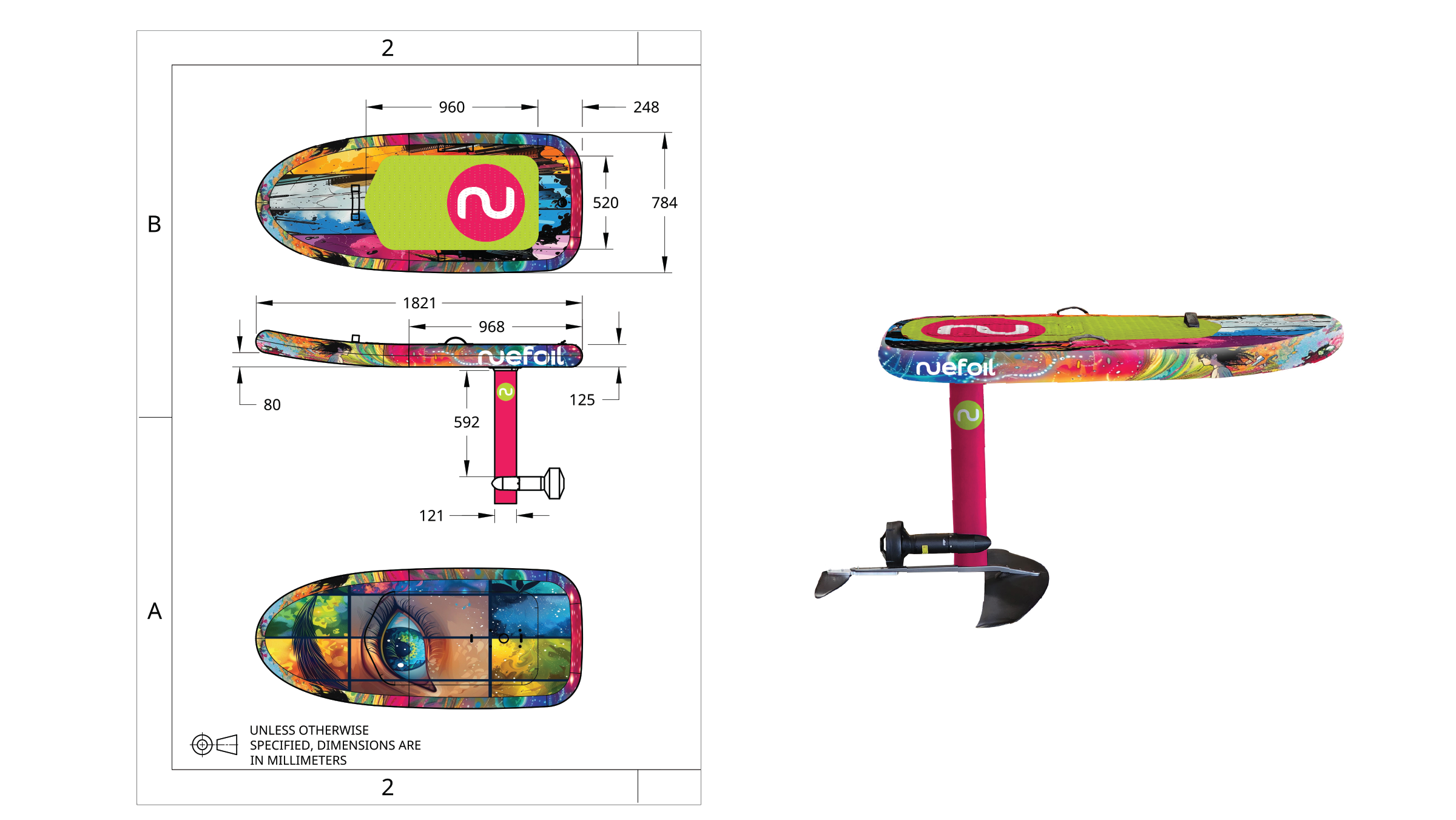
BOARDS
Proposal: To create a range of boards designs that are fresh, dynamic and collectible. New boards would be introduced on a regular basis.